One shared design language across your product, so a button, a form, or a card looks and behaves the same everywhere.
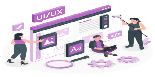
Once a product has more than a couple of screens and more than one designer or developer touching it, inconsistency creeps in fast: three different button styles, spacing that is close but not quite the same, components rebuilt from scratch instead of reused. A design system fixes that at the root: a documented, reusable set of components, patterns, and design tokens that everyone builds from.
We've built design systems for iGaming platforms with dozens of screens across web and mobile, FinTech products where consistency also supports trust and compliance, and Healthcare products where clarity cannot be sacrificed for visual flair. Every design system we build includes both the Figma component library designers use and the coded component library developers implement, kept in sync so design and development do not drift apart over time.
This is not just useful for large teams. Even a small team benefits early, because it is far cheaper to establish consistency now than to unwind years of one-off components later.
We keep engagement models flexible so you can start small, move fast, or scale a dedicated product team when the roadmap grows.
Clear scope, fixed budget, defined milestones. Perfect for MVPs and Phase 1 builds.
Agile-first approach where you pay for actual hours worked. Maximum flexibility.
Fully embedded engineers, daily standups, and CTO-level technical oversight.
SaaS development services for iGaming, FinTech, and Healthcare: multi-tenant architecture, subscription billing, and scalable cloud…
Mobile app development services for iOS, Android, React Native, Flutter, API integration, app modernization, and…
Custom AI agent development for iGaming, FinTech, Healthcare, and back-office operations. Autonomous, task-executing AI agents…
Straight answers about design scope, deliverables, and handoff.